Tallya
Tallya
Academic Project (Group)
A discreet public-safety app connecting Ottawa nightlife patrons with venue staff, designed and prototyped for a real client over a 15-week academic engagement.
- Type
- Academic Project (Group)
- Role
- UX/UI Designer & Documentation Lead
- Service
- UX Research / Wireframing / Hi-Fi Prototyping / Design Systems
- Year
- 2026
Overview
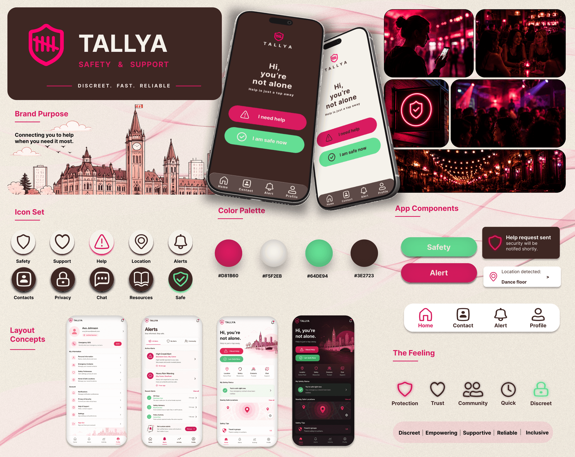
Tallya is a public safety mobile app that gives patrons in Ottawa's nightlife scene, starting with the Byward Market and Elgin Street areas, a discreet way to reach venue staff when something feels wrong. Our team of five designed the full UX/UI system for two connected experiences: a Patron app that stays calm and unremarkable until it's needed, and an Establishment dashboard that lets venue staff receive, locate, and resolve alerts quickly.
"Discreet. Fast. Reliable."
This case study documents the full 15-week engagement: client discovery, competitive research, personas, information architecture, lo-fi through hi-fi design, and the interactive prototype delivered at Final Review.
The Problem
Problem statement: Current safety solutions rely on users reacting quickly under stress, and in crowded nightlife environments, discreet and immediate support isn't always accessible. Tallya's founders wanted a way to connect patrons and venue staff directly, without drawing attention to someone who needs help.
Goals
- Let patrons call for help without drawing attention to themselves
- Design a patron experience usable in the dark, one-handed, or while inebriated
- Give establishment staff a fast way to locate and assist a patron in distress
- Build a design system consistent enough to scale across Ottawa's nightlife venues
- Support the full account lifecycle: sign-up, venue check-in, alerting, resolution, and history
Constraints
- Client discussions with Byward Market foot patrol were ongoing, so that integration stayed out of scope for this phase
- Real client, real weekly check-ins, real sign-off gates, not a self-directed timeline
- Five-person team meant version control and a shared design system mattered from week one
- 15-week academic term with a scheduled study break partway through
Research & Discovery
Method: Competitive analysis of existing personal-safety apps, plus target-user research into Ottawa's 18-25 nightlife demographic and venue-staff workflows.
Key findings
- Existing safety apps aren't nightlife-specific. bSafe offers strong location sharing but wasn't built for the specific pressure of a loud, crowded venue.
- Emergency-only tools miss the in-between cases. Noonlight handles real emergencies well but has limited venue-side communication for situations that need staff attention, not 911.
- Discretion is the whole design problem. Every patron we considered needed a way to act without drawing attention to themselves, which shaped nearly every interface decision that followed.
- Staff need speed under pressure. Venue staff needed fast, unambiguous alerts they could act on immediately, even in a loud, dark room.
Competitive landscape: bSafe and Noonlight both solve pieces of the problem, personal safety tracking and emergency response respectively, but neither offers discreet, two-sided communication built specifically for the relationship between a nightlife patron and venue staff. That gap became Tallya's core differentiator.
Strategy: Personas & Journeys
- Maya, the university student (21, Ottawa): wants a way to get help without making the situation worse or embarrassing herself in front of friends.
- Ethan Park, the business development associate (30, Ottawa): attends networking events at unfamiliar venues and wants safety tools that feel subtle, not disruptive.
- Sarah Mitchell, the bar manager (34, Ottawa): manages a busy downtown venue and needs to identify and reach a patron in distress quickly, even during a packed weekend shift.
Key user journeys
- Patron: Feels unsafe → opens the app to a discreet decoy-style home screen → holds the alert button (2-3 taps) → venue staff and trusted contacts are notified → marks themselves safe once resolved.
- Staff: Receives a discreet alert on the dashboard → locates the patron by venue area → responds and resolves in-app → logs the incident for the venue's records.
Ideation
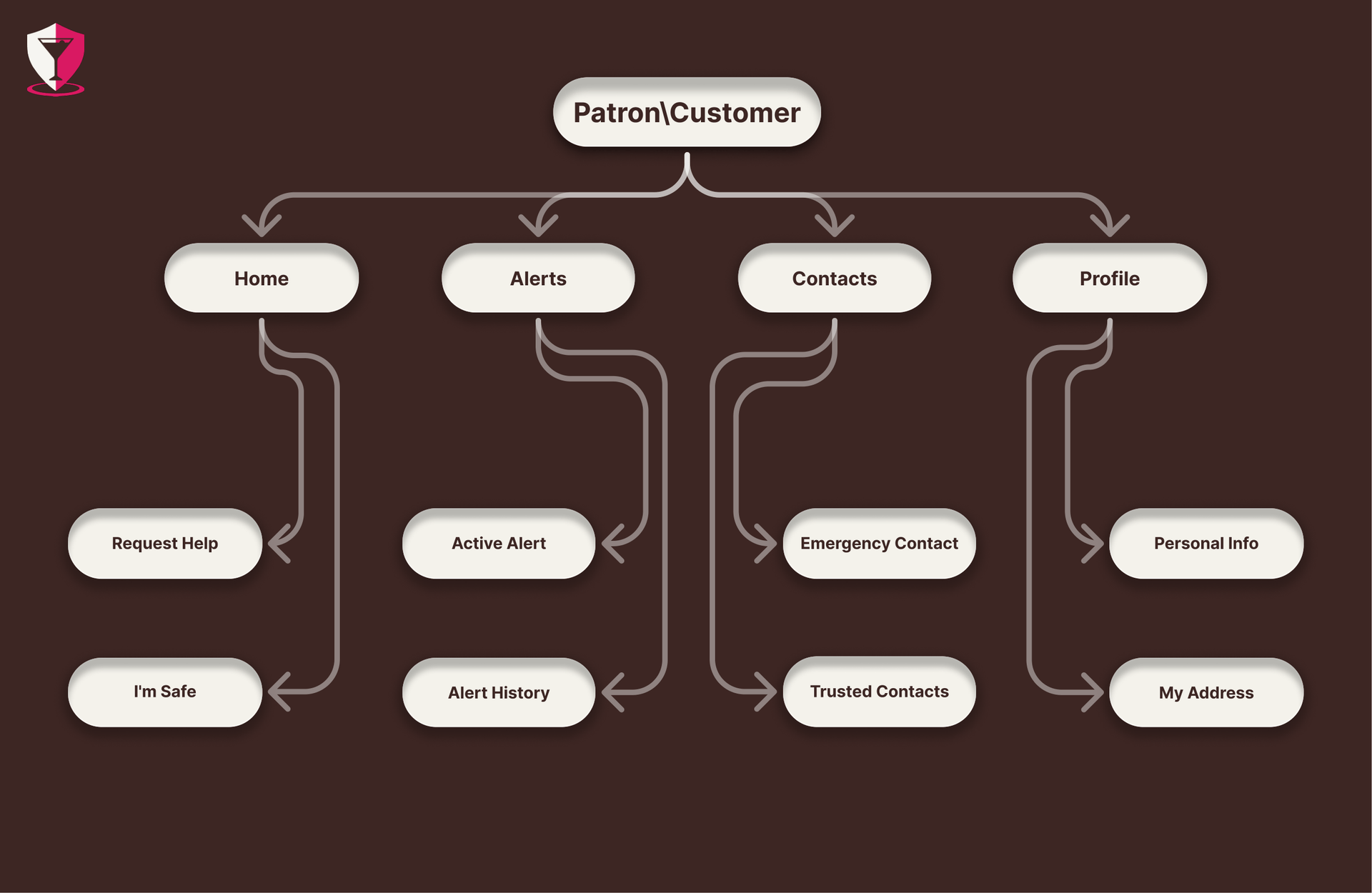
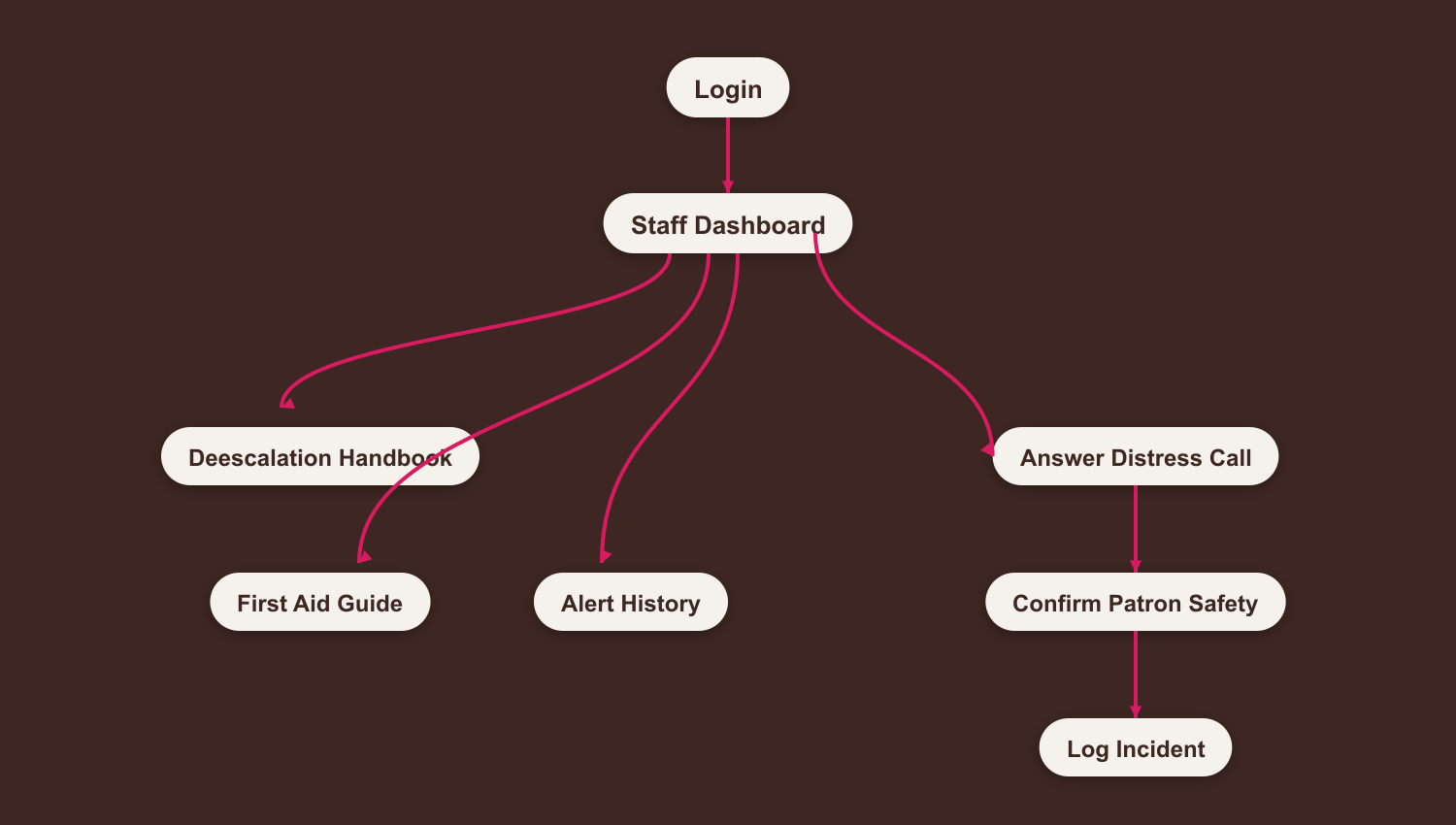
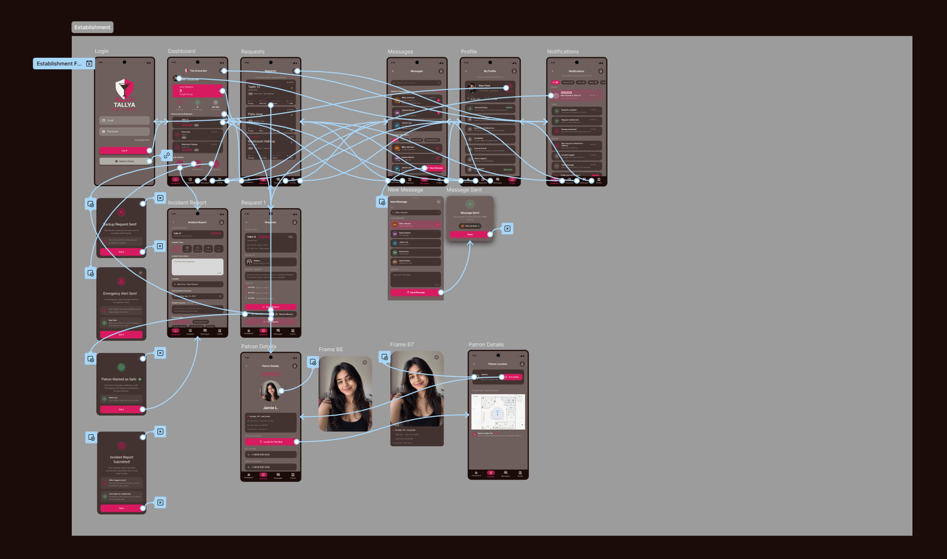
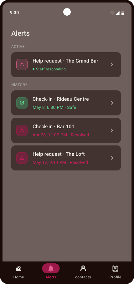
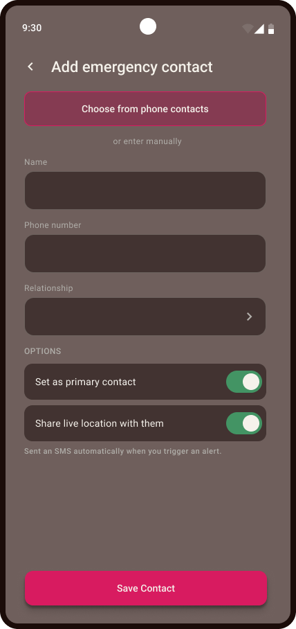
Information architecture went through two full rounds. The first version mapped a Patron/Establishment split, defining Home, Alerts, Contacts, and Profile as core sections. The second version, developed after client feedback, expanded the account lifecycle to include full sign-up, email verification, and venue check-in via search or QR scan, alongside a more detailed Alerts and Contacts structure. The Establishment side was mapped separately: Login through to a Staff Dashboard branching into Notifications, Messages, Profile, and Ongoing Requests, down to individual Request Details, Incident Logging, and Patron Location.
High-Fidelity UI Design
Color system
| Color | Hex | Role |
|---|---|---|
| Pink | #D81B60 | Alerts, primary actions, brand accent |
| Cream | #F5F2EB | Base / light backgrounds |
| Green | #64DE94 | Safe states, confirmations |
| Dark Brown | #3E2723 | Grounding dark backgrounds, staff-side UI |
The brand identity centers on five feelings: protection, trust, community, quickness, and discretion. Icon set, color palette, and component library (buttons, alert cards, nav bar) were designed first as a shared style tile so all five team members' screens stayed visually consistent across both apps.
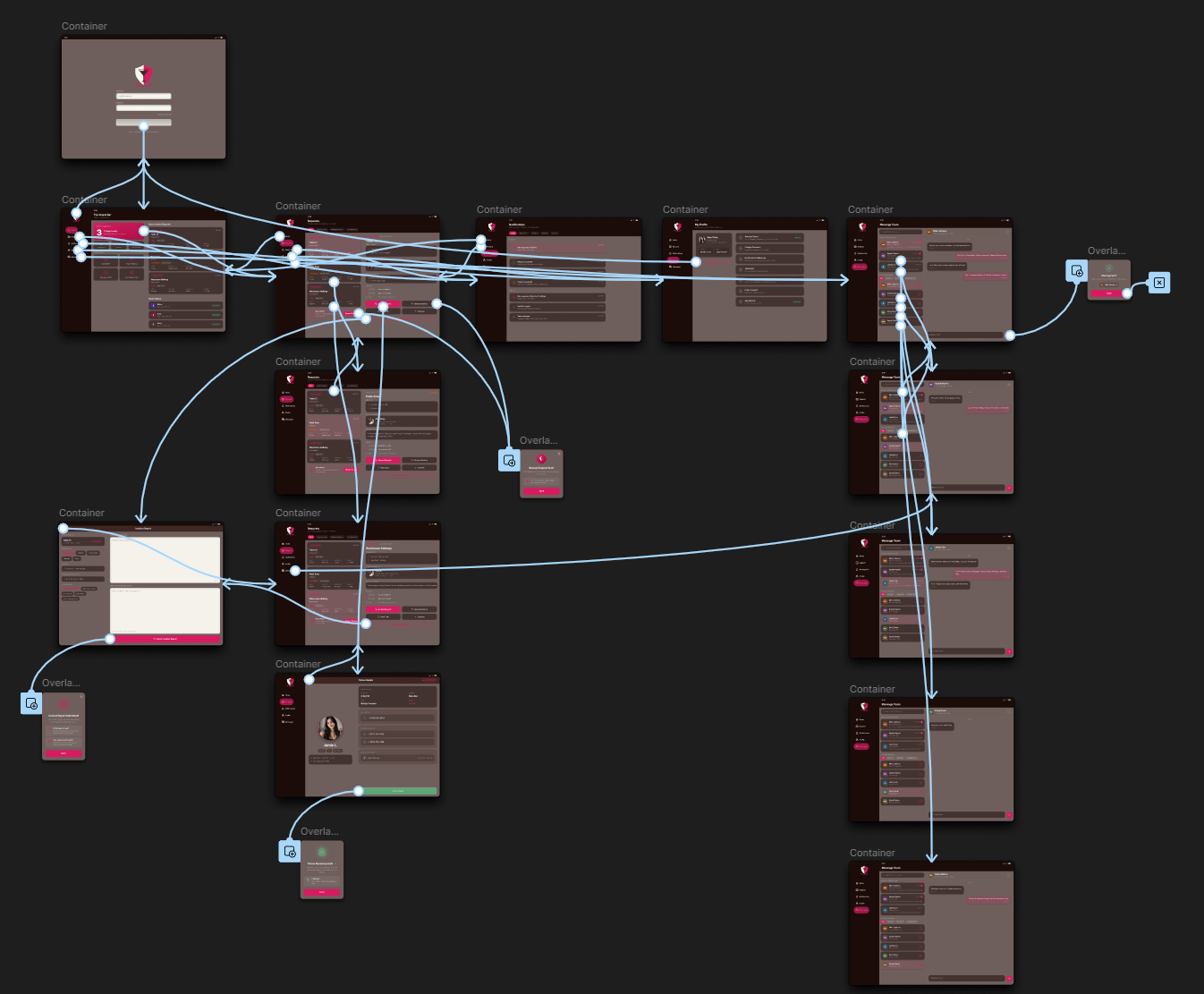
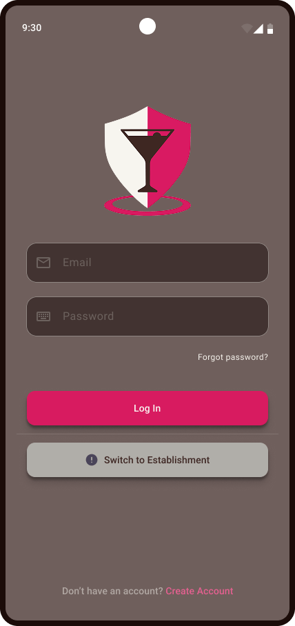
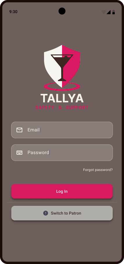
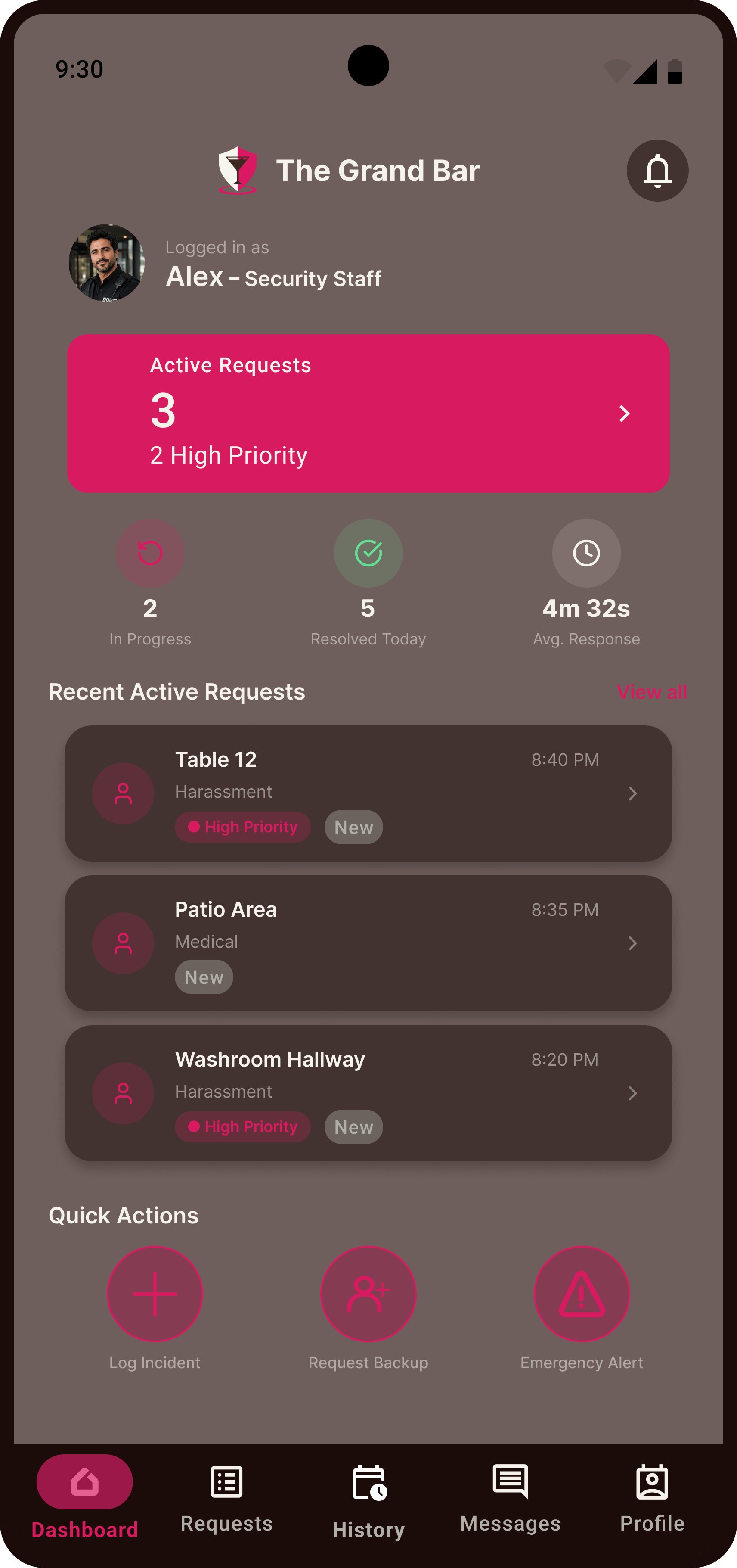
Screens were built across two user types, Patron and Establishment, sharing one design system throughout.
Prototyping
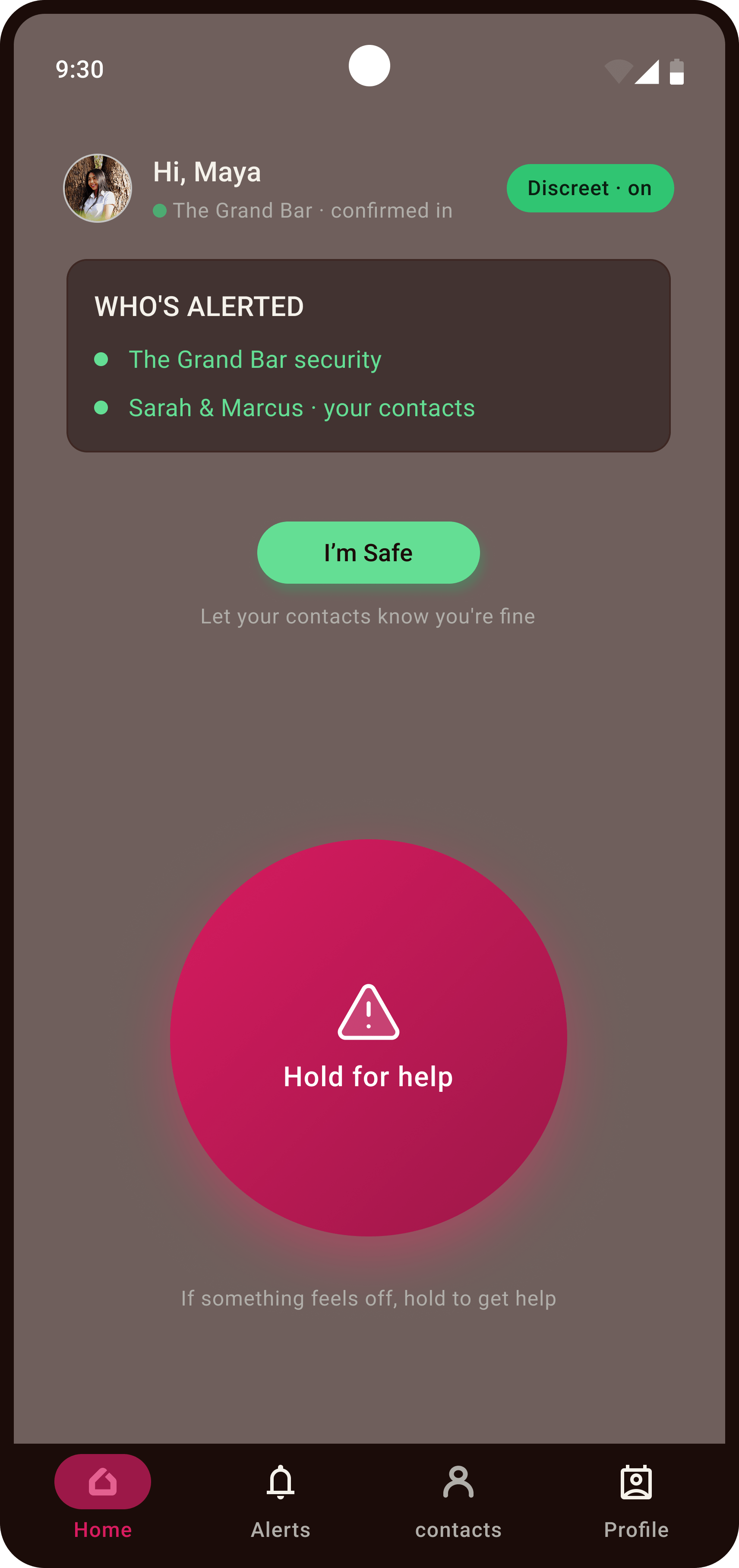
Designed in Figma, moving from lo-fi grayscale wireframes to a fully branded hi-fi interactive prototype. The Patron app's signature interaction is the "Hold for Help" screen: a single large press-and-hold control that sends a discreet alert to venue staff and the patron's trusted contacts simultaneously, with the home screen otherwise reading as an ordinary, unremarkable app.
Standout interactions
- Decoy-first home screen: the Patron app deliberately shows nothing alarming until the moment it's needed, so it never looks out of place if someone else sees the screen.
- 2-3 tap alert flow: getting from "I need help" to an alert reaching staff takes as few taps as possible, designed to work in the dark or one-handed.
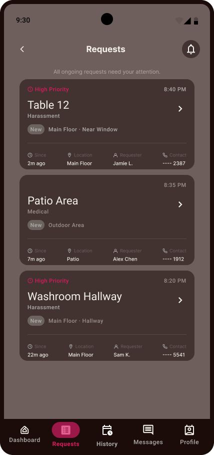
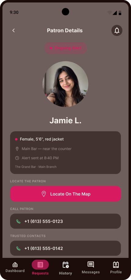
- Establishment request routing: incoming alerts on the staff dashboard surface patron location, priority, and history in one view, so a staff member can act without hunting for context.
Prototype connections
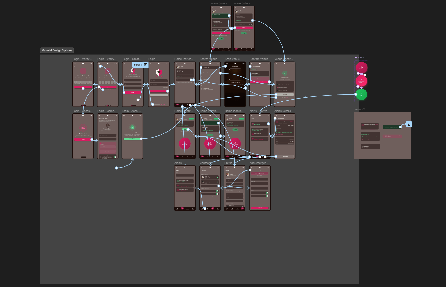
Every screen was wired together in Figma into a fully navigable prototype rather than isolated static frames, covering the complete Patron flow (login and sign-up through venue check-in, Hold for Help, and profile management), the Establishment flow (login through requests, messaging, and incident logging), and a tablet layout for Establishment staff working from a fixed station.
Client & Course Validation
Work was reviewed and signed off by the client, Tallya founders Claire McLeman and Erin McNish, at set milestones across the term: project charter, personas, moodboard and branding, sitemaps, and the final hi-fi prototype, each requiring an explicit approval before the team moved forward. Weekly meetings kept research, design, and client expectations aligned from kickoff through final handoff.
Reflection
What I learned: Working as part of a five-person team on a live client engagement meant design decisions had to hold up in front of people outside the classroom. Keeping documentation, meeting minutes, and design rationale organized across 15 weeks taught me how much of good UX work happens outside the design tool, in the alignment between team members, client expectations, and shifting scope.
What I'd do differently: Push for interactive prototype testing earlier in the timeline rather than concentrating it near the end, so usability findings could inform more of the hi-fi design rather than just the final polish pass.
What's next: The completed design system and prototype were handed off to the client in the week following Final Review, including full documentation, source files, and a recommendation to pursue usability testing and a potential integration with Byward Market's foot patrol program.
Disclaimer: Tallya was completed as a group academic project for Algonquin College's Interactive Media Design program, in partnership with a real external client. Intellectual property for the final product belongs to Tallya; this case study documents my role and contributions on the design team, shared here with authorial credit as permitted under our project agreement.