RentEasy Uganda
RentEasy Uganda
Personal Project
A three-sided rental and home-services marketplace, designed to eliminate broker fees in Uganda.
- Type
- Personal Project
- Role
- Solo Product Designer
- Service
- Product Design / UX Research / Prototyping
- Year
- 2026
Overview
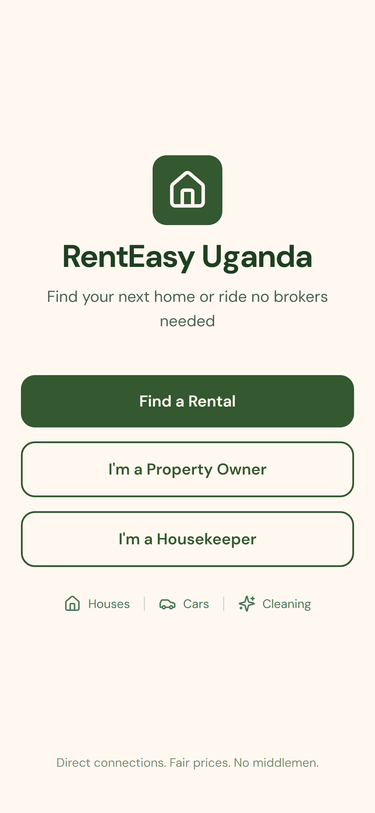
RentEasy Uganda is a mobile marketplace connecting property owners, renters, and independent housekeepers directly, removing the informal broker layer that taxes nearly every rental transaction in Uganda. What began as a simple two-sided rental app grew, through real user feedback, into a three-sided marketplace that also includes on-demand laundry and home-cleaning services.
"Direct connections. Fair prices. No middlemen."
This case study documents the full design process: problem framing, research, ideation, wireframing, high-fidelity design, prototyping, and iteration based on real user testing.
Fully interactive: tap through the real app, right here.
Open live prototypeThe Problem
Problem statement: Renters and property owners in Uganda rely on informal brokers to find and fill house and car rentals, while trusted laundry and cleaning help is found only through word of mouth. RentEasy Uganda unifies rentals and home services into one direct, no-broker marketplace.
Goals
- Let renters connect with owners directly, no broker in between
- Let guests browse listings freely, only requiring signup when they want to act
- Verify owners and housekeepers to build trust
- Support three sides of a marketplace (renters, owners, housekeepers) in one app
- Keep pricing transparent and auto-calculated, in UGX
- Design for full local relevance: UGX, +256 phone format, real Kampala districts
Constraints
- Personal project timeline: design and prototype first, build later
- Android-first, given Uganda's device market
- Must remain usable on 3G network speeds
- Designed for low-to-mid tech literacy
- Three distinct user types to design for, not one
- No payment integration yet; Mobile Money is a future phase
Research & Discovery
Method: Informal usability testing. The prototype was shared directly with friends and family, mostly renters with a few property owners. Housekeeping-related feedback surfaced casually from the same conversations, rather than a formal test round.
Key findings
- Renters value pre-booking chat. Testers described messaging an owner and negotiating before committing as the most praised part of the whole prototype.
- Brokers add cost at every step. Testers described a rent markup plus separate "viewing fees" just to see a property, with no way to verify pricing against the real market.
- Car rentals rely on chains of connections. Visitors from abroad often reach a car owner through "someone who knows someone," with each link adding a commission.
- Trusted housekeeping help is hard to find. People are willing to pay for cleaning or laundry help; the blocker is trust, not cost.
- Early usability gap (since fixed). v1 testers wanted to browse listings before signing up, which directly led to the guest-browsing flow.
Competitive landscape: Existing options like agent-run sites (e.g. Rentify.co.ug) redirect to WhatsApp instead of in-app chat, and Facebook/WhatsApp groups remain informal and agent-posted. None combine direct in-app chat, a full housekeeping booking flow, and a genuinely broker-free model the way RentEasy does.
Strategy: Personas & Journeys
- Grace, the value-conscious renter (29, Kampala): wants a fair-priced rental without broker markup or viewing fees.
- Sarah, the independent property owner (41, Kampala): owns 2–3 units, wants to fill vacancies and screen renters herself.
- Aisha, the independent housekeeper (34, Kampala): offers cleaning and laundry, needs a way to prove reliability to strangers.
Key user journeys
- Renter: Browse as guest → soft signup prompt → sign up → message owner directly → book or schedule a tour, no broker fee added.
- Housekeeping: Renter picks a service → sees an auto-calculated live price → confirms → housekeeper receives the request → accepts or declines in one tap.
Ideation
Three concepts were weighed: an agent-mediated listings model (rejected: it just digitizes the broker layer), rentals-only with no housekeeping (rejected: it ignores real unmet demand surfaced in research), and a three-sided marketplace with guest browsing, selected as the only concept answering every friction point research surfaced.
The concept evolved across three rounds: v1 shipped Renter and Owner roles only, with no guest access; v2 added guest browsing after testers wanted to explore before signing up; v3 added the Housekeeper role as a full third side, with its own signup, dashboard, and accept/decline flow.
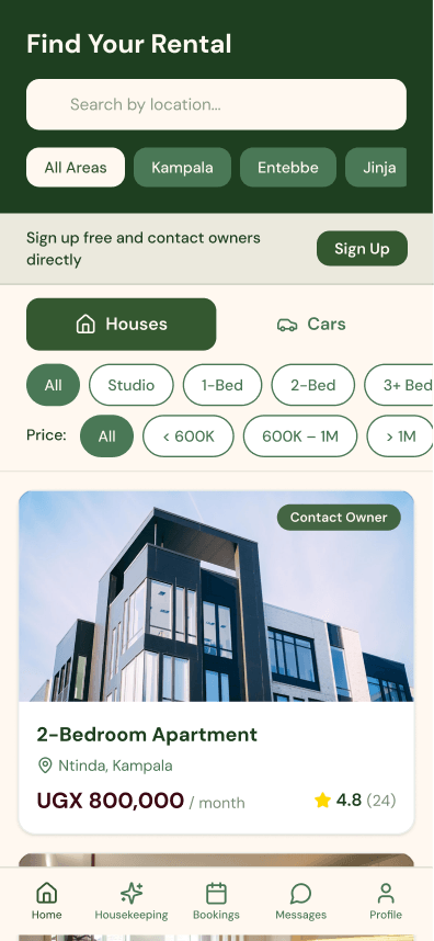
Browse listings home screen
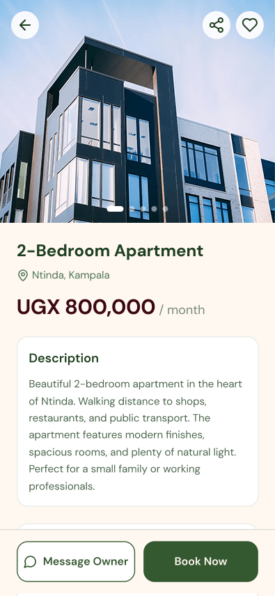
Listing detail screen
High-Fidelity UI Design
Color system
| Color | Hex | Role |
|---|---|---|
| Black Forest | #1E3F20 | Navigation bars, headers |
| Hunter Green | #345830 | Primary buttons, CTAs |
| Fern | #4A7856 | Icons, filter chips, secondary elements |
| Floral White | #FFF8F0 | All backgrounds |
| Night Bordeaux | #3D0814 | Prices, alerts, destructive actions |
21 renter screens, 14 owner screens, and 11 housekeeper screens share the same header pattern, bottom nav style, card treatment, and button system, maintaining visual consistency across three distinct user roles rather than the more typical two.
Prototyping
Built in Figma Make using React + TypeScript with React Router: a genuine coded prototype, not a static click-through. Real state is passed between screens: selected listing, basket contents, running totals.
Standout interactions
- Live basket pricing: quantity steppers update the sticky total instantly, no reload.
- Dynamic price by house size × cleaning type: selecting a house type and toggling Simple/Deep instantly recalculates the price.
- Guest-to-renter handoff: browsing state persists across the sign-up prompt, so the transition feels seamless rather than a reset.
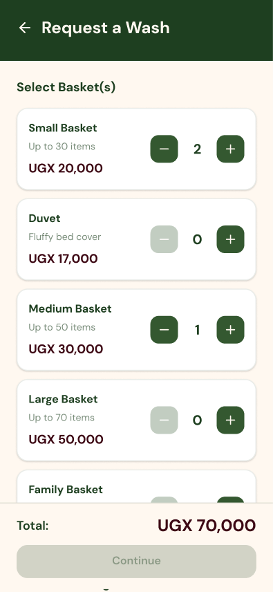
Request a Wash screen with live basket pricing
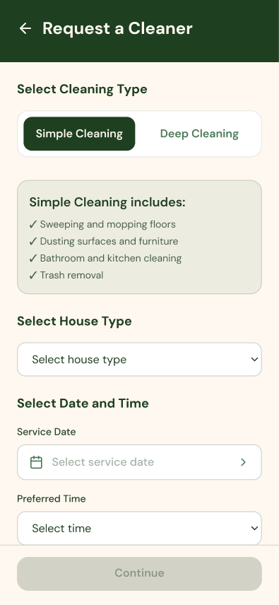
Request a Cleaner screen with dynamic pricing
Before sharing externally, all three role flows were walked through solo, confirming no dead-end screens across 57 screens and that state correctly carried across transitions.
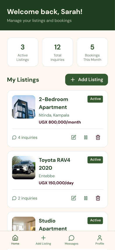
Owner dashboard screen
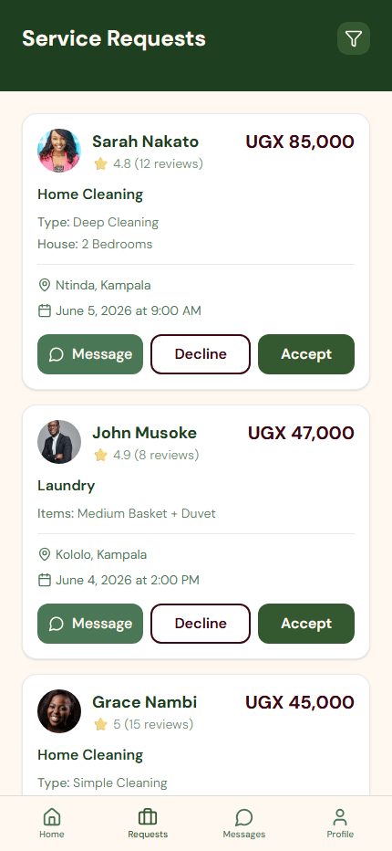
Housekeeper service requests screen
User Testing & Iteration
What worked (kept as-is): In-chat negotiation before booking, consistently described as "smooth."
What didn't work (changed):
| Before | After | |
|---|---|---|
| Flow | Welcome → forced signup → browse | Welcome → browse freely → signup prompt only on action |
| Risk | Users could leave before seeing any value | Value is shown before any commitment is asked |
During this same testing round, casual feedback about needing trusted cleaning and laundry help led directly to designing the Housekeeper role as a full third side of the marketplace, not an afterthought but a direct response to a gap surfaced in testing.
Reflection
What I learned: Designing for three distinct user roles at once surfaced tradeoffs a two-sided marketplace wouldn't, particularly navigation consistency (each role needed a different bottom nav) and handoffs between roles (a renter's booking becomes a housekeeper's incoming request, requiring both sides to be designed together).
What I'd do differently: Wireframe before high-fidelity design, especially for the housekeeping pricing screens where live-calculation logic needed careful layout thinking. I'd also run a more structured testing round with a wider mix of property owners.
What's next: Build the front end for real using the existing component and routing structure, integrate Mobile Money (MTN/Airtel) for payments, and run a structured usability study with a larger, more balanced group of renters, owners, and housekeepers.
Disclaimer: This is a design-stage personal prototype, not a production app. Payments, ID verification, and moderation are designed for conceptually but not implemented.